Intervention: Google Plus + Picasa + Photos (x) (Mobile + Desktop) = One Blurry Mess

Intervention: Google Plus + Picasa + Photos (x) (Mobile + Desktop) = One Blurry Mess

Pre-mobile and pre-Google Plus, Google had a handle on the creation and sharing of photo albums. Picasa took some time to learn, but once you got the hang of it, photos synced correctly from the desktop to the web, and you knew with whom you were sharing—key features of any social site/app/service, and usually difficult to get right. Everything seemed to work. So, with my photos I stuck with Picasa, and dismissed Facebook and whatever Apple was doing, which seemed to lag behind its competitors in features. I also use Gmail so I figured that t...

Intervention: NJ Transit Train Status—Do the Math?

Intervention: NJ Transit Train Status—Do the Math?

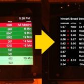
You’re coming to a business meeting in New Jersey. You don’t ride NJ Transit every day, if ever. You arrive at the station house and see this screen: The red bars means trains are delayed, and green means they’re on time, right? Wrong, but it’s probably going to take you a while to realize it as you sort through the confusing information design, while urgently trying to figure out what track you’re supposed to be on. Hope you make your train! As you start to realize that you’re wrong, you notice the light gr...

Inspiration: The Coffee Shop Where Everyone Pays for Everyone Else’s Drinks

Inspiration: The Coffee Shop Where Everyone Pays for Everyone Else’s Drinks

This is amazing. And is so much fun. It shows the power of language in shifting perceptions about an everyday experience we take for granted. And it shows actual people (not corporations) authentically co-opting commerce to do something good and joyful and connected. What an incredible way to re-invent for the better an experience we take for granted. Cheers to Bluffton, South Carolina.

Inspiration: The Vertical Credit Card Solves A Common Usability Problem

Inspiration: The Vertical Credit Card Solves A Common Usability Problem

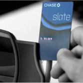
Here’s a solution to the anxiety-prone and time-wasting moment experience of figuring out which way to swipe a credit/debit card, while people in line behind you roll their eyes and tap their feet: A vertical credit card. I don’t know Chase’s motives for designing a credit card with a vertical orientation instead of a horizontal one (probably a gimmick to stand out in the marketplace), but Eureka! This is the solution to endless confusion when swiping a card at the grocery store, gas station, or millions of places where customers can ne...

Investigation: Saving 30% on Dinner is Great, But How Can This Last?

Investigation: Saving 30% on Dinner is Great, But How Can This Last?

This receipt (swiped from a Facebook post for Savored.com) shows a discount of $612.65 on dinner from Club A Steakhouse in Manhattan. So here’s what I want to know: How can restaurants that participate in Savored.com (Facebook | Twitter) and Restaurant.com (Facebook | Twitter) actually draw enough business to cover the costs of these extraordinary discounts? I get that this is a marketing expense, and not every check is discounted, which reduces the average per-check discount. And to fill more seats and possibly create some momentum, perhaps...

Inspiration: Subtle, But Nice Effect for a Video Player/Browser

Inspiration: Subtle, But Nice Effect for a Video Player/Browser

It’s subtle, but the New York Times designed a nice effect for a full page video player/browser: the left nav and Other Videos nav on the bottom dim unless you roll over them. It helps the video stand out, and provides fewer visual distractions while watching it. Subtle. Not setting the world on fire for video online. But a nice touch. Now if they could only dim that Citibank ad…it’s like a flashlight to the face during the movie. See it in action.

Intervention: Google Map Searches California for a Restaurant a Block Away in Delaware

Intervention: Google Map Searches California for a Restaurant a Block Away in Delaware

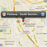
Google, you drive me nuts with this: when I’m in Bethany Beach, DE (before this screenshot I clicked the current location arrow and it showed me where I was in BB), and I search “Parkway” to get the phone number of a restaurant a half mile away, why are you giving me as a result the town of Parkway-South Sacramento, CA? This happens quite a bit. Please fix your algorithms.

Intervention: Yelp Mobile Won’t Stop Selling the App—But I Already Have It!

Intervention: Yelp Mobile Won’t Stop Selling the App—But I Already Have It!

Yelp: stop showing me this screen. You’re wasting my time and are chipping away at my goodwill toward you. I already have the app. I’m on the mobile site for a reason (usually because I clicked on a Google search result). At least let me click to never show this screen again. Maybe better: deliver the mobile result (I might want it vs the app for some reason), but ask me if I’d like to see the page in the mobile app instead (I might think that’s a brilliant, time-saving idea under certain circumstances).

Intervention: iOS Calendar Needs to Provide Link to Map from Location Field

Intervention: iOS Calendar Needs to Provide Link to Map from Location Field

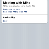
iOS calendar, why can’t I tap on my meeting location and have you serve up a map? Fix this, so I don’t have to: tap Edit tap the title/location area long tap the location field tap Select All tap Copy tap the home button find and tap Maps tap Search (if i’m not there already) or Edit if I’m in the directions area) long tap into the field tap Select All tap Paste tap Search or Route button Apple, save me 12 steps, please. Provide a link to the meeting location when you recognize that it’s an address.

Investigation: The Netflix Conundrum: Streaming or DVDs

Investigation: The Netflix Conundrum: Streaming or DVDs

We’re not paying $16 a month for Netflix. And let’s face it, I’m not becoming a Blockbuster customer (too much brand baggage). We’ll pick Netflix streaming or DVDs, until a great competitor comes to our attention. In the meantime, what should we do? Here’s my analysis: We have a DVD at home, unwatched, from last August, so clearly, making time to watch this particular DVD is an issue. Yes we want to see the move, but it’s usually “not this movie tonight.” We’ll sometimes stream a movie we’d rather like to watch instead, or ...