Email Intervention: Announcing Something “Cool” at The Mercury News
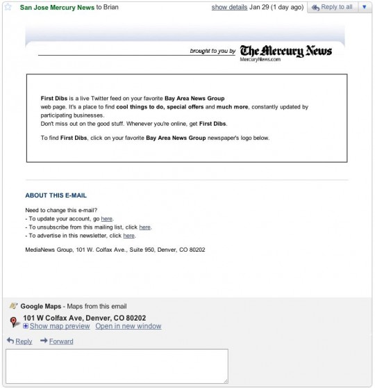
January 30th, 2011It won’t take you long to see why this is one of the worst marketing emails sent this year:
If this were an email from an impoverished newsroom, announcing a new channel for actual Mercury News journalist-reported news, I’d be a little more forgiving (newsroom staffs has suffered badly in recent years). But it’s not. This is a business initiative, launched by a business team. It’s a new feed of deals called First Dibs. And it features “cool” things. Okay?
As a marketing effort, this is a Yugo set on fire, plunging over a cliff (wait—that would actually be exciting to watch). This is not how you excite people about a new “product. The email admin section at the bottom is longer and more useful than the body of the email. But in the body of the email, there are no links. No pictures. No logo to click on, as the email says there is. This is so bad I almost feel bad calling it out. A fourth grader could do better.*
The newspaper business ain’t what it used to be, we all know that. But it makes you wonder—if they’ve fired all the real journalists to turn papers into “stronger” businesses, who have they hired to run these businesses? Is there a marketing department at The San Jose Mercury News (or it’s corporate owner in Denver, CO)? A marketing intern? A fourth grader?*
Digital Ineptitude
Unfortunately, it’s not just marketing on the hook. The Mercury News website is outdated and lacking. The absence of photography in most stories is frustrating, to say the least (particularly when the subject of stories is something visual). The rudimentary layout of the site is barely fine for a quick local news fix, but if they ever intend to build a real community or a business (e.g. pay wall) around the site, it will take a major redesign to make it worth a penny of anyone’s salary.
I love my hometown paper (well, what it used to be), so watching it lifelessly stumble through the digital age is tough. It makes me long for the heydays, the creative days, the vital days.
*Design-an-Ad
When I was in the fourth grade (a belated thanks to my teacher, Mrs. Marianna Willis), The San Jose Mercury News spurned in me a passion for newspapers, and in particular visual composition of the printed page. It has led directly to my career analyzing, building and improving user interfaces online. With its Design-an-Ad contest, the Mercury would allow young people to design advertisements for local businesses and compete to have them appear in the newspaper. It was a brilliant program which brought additional exposure to participating advertisers, raised ad sales for the paper (I presume), stoked interest in the newspaper business (even if on the business side of the house), and let kids discover the link between learning, creativity and business—and of course, it got the good old American competitive juices flowing. For a couple weeks, going to school was super fun.
Back then, The Mercury News felt more vital, more relevant to the times it covered. It caught the imagination of young people. I have a lot to thank them for. But today, in a contemporary medium, the paper announces a “cool” new interactive feature, online, with five lines of straight text coming from a corporate address in Denver, CO. And worse, the product is a deal feed—the latest, and increasingly ubiquitous, attempt by just about everyone to scrape a buck out of people’s wallets. Long live innovation, creativity, and the San Jose Mercury News.


 Troubled experiences that need a little counseling ("Interventions"), great experiences that serve as role models ("Inspirations"), and curious or questionable experiences teetering on the brink of a breakdown ("Investigations"). We'll showcase smart experience strategies, great interaction design, and thoughts on transforming marketing meltdowns into model experiences. Our mission: help companies create great experiences that attract attention, convert new customers, generate engagement and cultivate loyalty.


