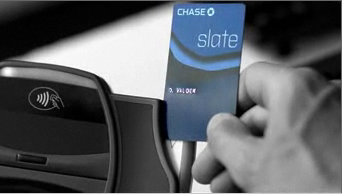
Inspiration: The Vertical Credit Card Solves A Common Usability Problem
January 10th, 2012
Here’s a solution to the anxiety-prone and time-wasting moment experience of figuring out which way to swipe a credit/debit card, while people in line behind you roll their eyes and tap their feet: A vertical credit card.
I don’t know Chase’s motives for designing a credit card with a vertical orientation instead of a horizontal one (probably a gimmick to stand out in the marketplace), but Eureka! This is the solution to endless confusion when swiping a card at the grocery store, gas station, or millions of places where customers can never seem to remember how to perform the simple swipe.
Horizontal swiping machines are very rare (NYC taxis and the occasional retailer). So why are cards designed for them? Or why did card reader manufacturers (mostly) decide to switch the orientation? Why didn’t they get together to make the user experience less anxiety-ridden for consumers?
It doesn’t matter. But while we wait for contact-less payment cards to take over the world (or until we catch up with Europe and get the more secure PIN-and-chip card) it’s time to change the what we’ve got. As the organization that owns the end customer relationship, banks should start redesigning their cards in a vertical orientation—but make sure to add a small indicator on the right side of the card (the long end now), so we can tell which bank card is poking out of our horizontal wallets.

 Troubled experiences that need a little counseling ("Interventions"), great experiences that serve as role models ("Inspirations"), and curious or questionable experiences teetering on the brink of a breakdown ("Investigations"). We'll showcase smart experience strategies, great interaction design, and thoughts on transforming marketing meltdowns into model experiences. Our mission: help companies create great experiences that attract attention, convert new customers, generate engagement and cultivate loyalty.


