Intervention: NJ Transit Train Status—Do the Math?
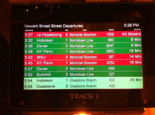
August 1st, 2012You’re coming to a business meeting in New Jersey. You don’t ride NJ Transit every day, if ever. You arrive at the station house and see this screen:
The red bars means trains are delayed, and green means they’re on time, right?
Wrong, but it’s probably going to take you a while to realize it as you sort through the confusing information design, while urgently trying to figure out what track you’re supposed to be on. Hope you make your train!
As you start to realize that you’re wrong, you notice the light green bars at the bottom. What do they mean? They’re at the bottom so maybe it means they’re later (yes if everything is on time, no if not), or past peak time when the fares drop (no). After a few minutes of study you might see that the color refers to a train line. Good job, you figured it out! But you may have just missed your train. So we have our first problem to solve: the use of color. We must find a way to use color it in way that doesn’t conflict with typical learned color signals—green is good, red is bad.
So you’re here to take the 5:38 to NY Penn. It’s 5:28 (top right) so you have 10 minutes to make sure you’re on the right track (you’re now on track 1, which unintuitively is actually the second of three tracks—the middle track—from the main station building where you buy tickets). Of course you know this all too well by now because when you entered the station, you followed the signs at the main station building to New York-bound trains on Track 2, only to discover once up the flight of stairs where there’s a monitor, that you’re in the wrong place. Hope you didn’t just miss your train! Is there a reason the signs are wrong—temporary construction perhaps? If so, temporary signage steering people away from the wrong track would be nice, considering how often minutes matter when you’re running to catch a train. So interface problem number two: the signs on the wall are wrong. That can be fixed quite easily, no?
Back to the monitor…
You have 10 minutes. But what’s that “19 Min” on the right, under the Status column? The train’s 19 minutes late, right? Wrong.
And if you haven’t figured out the color issue yet, you may now be trying to figure out the connection between the green row and the 19 Min.
Does anyone around here know when the train will leave? Someone nearby explains that it means the train will be here in 19 minutes.
Huh? So passengers have to do math—even worse, time math!—to know when a train is coming? Problem #3: you have to do math to figure out when your train will arrive. Sorry right-brainers and anxious people quickly trying to make sense of the board.
Okay, so let’s do the math. It’s 5:28. In 19 minutes it will be…add 20 for :48, minus one for 47. It will be here at 5:47. Not too painful, right? But at this point, you may not yet realize what track you’re supposed to be on, or how much time you have to get there. What if the time was closer? Anxiety is not your friend during math problems.
So now we know the train will leave at 5:47. But instead of just saying so, the first column actually says “Departs” at 5:38. Wrong! It was SCHEDULED to depart then. I will now depart at 5:47. Confusing, no? Just tell us when the train will leave!
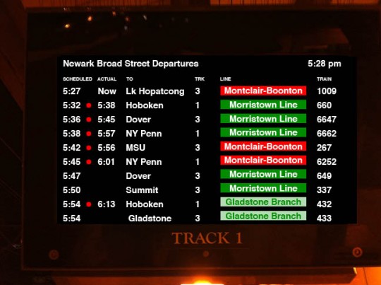
With all the transit systems in the world, surely there is a better model out there. If I worked for NJT, I’d be inclined to do a little research. But I don’t. So instead, I’ll take a stab in the dark and make a design proposal to turn the board of mysteries into a helpful information tool for both unfamiliar and familiar riders. Here goes:
So what’s changed?
1) I arrive and can quickly see one of two things:
a) If I know my original train time, I can find it in column one, then read to the right (the next column) to see if it’s delayed, and when it will actually leave, whether delayed or not.
b) If I don’t know my original train time, I can look at the destination column, then quickly look to the left to see the departure time of the train.
Also, the first two column headings are now “Scheduled” and “Actual.” No more open-to-interpretation label, “Status,” with a number of minutes. Instead, clarity. No math required! Problem solved.
2) Because the color bars are limited to the Line column, I have a much better shot at understanding that the color relates to the line, not the on-time status. Confusion reduced or eliminated. Color problem solved.
3) A printed note (not depicted here) hung on every incorrect directional sign in the station, during construction, pointing people to the right track numbers. How many trains go in and out of this station every day? Can not one of them carry an employee with a roll of tape and a stack of signs? Is there no station master? Surely, this is a problem that can be solved.
And the train traveler’s experience becomes one of comfort and confidence, making the train a more pleasant experience, and just maybe, getting the traveler home sooner. That’s good design.


 Troubled experiences that need a little counseling ("Interventions"), great experiences that serve as role models ("Inspirations"), and curious or questionable experiences teetering on the brink of a breakdown ("Investigations"). We'll showcase smart experience strategies, great interaction design, and thoughts on transforming marketing meltdowns into model experiences. Our mission: help companies create great experiences that attract attention, convert new customers, generate engagement and cultivate loyalty.


